SPECIAL OFFER BUY 3 JERSEYS = GET 1 FREE

Inter Milan Jersey History: How the Black and Blue Stripes Became an Icon
A deep-dive into the Inter Milan jersey history: from the original 1908 black and blue stripes to the most iconic kits of the 1960s, 1990s, and beyond. Real fabric details, design shifts, and what makes the Nerazzurri look instantly recognizable across every era.
In this article8 sections
- Where the Black and Blue Stripes Came From
- The Cotton Era: 1908 to the 1960s
- The Grande Inter Years and the Kits That Carried Them
- Manufacturer Eras and How They Changed the Fabric
- Away Kits and Third Shirts: Where Inter Took Real Design Risks
- The Return to Heritage: Kits from 2021 Onward
- Frequently Asked Questions about Inter Milan Jersey History
- What the Stripes Actually Tell You About the Club
Where the Black and Blue Stripes Came From
The Inter Milan jersey history starts with a deliberate act of identity: in 1908, a breakaway group of founders chose black and blue vertical stripes from scratch, reportedly inspired by the night sky, black for darkness and the deep blue for the stars cutting through it. That founding story matters more than it might seem. The colors were not inherited from another club or borrowed from a city flag. They were picked fresh by people building something new from the ground up.
The split itself happened over a principle. A group of players and administrators walked out of Milan Cricket and Football Club over a dispute about foreign players. They wanted a club open to all nationalities, so they named it Internazionale. The name was the whole philosophy. And the shirt, black and blue, was meant to belong to no single place.
Through regime bans, financial crises, two World Wars, and eleven Serie A titles in the space of seventeen years, those vertical bands stayed. A lot of clubs redesign their identity every five years chasing commercial relevance. Inter’s color story has held for over a century, and that consistency is itself a kind of statement.
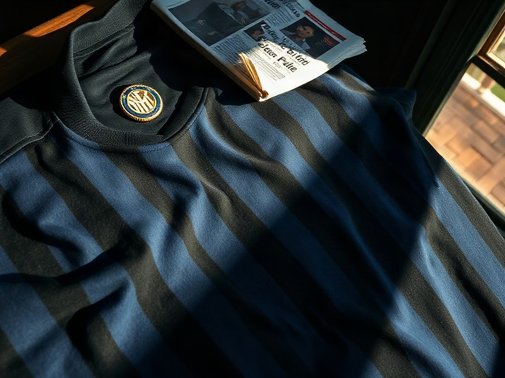
The very first shirts were loose-cut, heavy cotton, with a simple round neck. No badge on the chest, no manufacturer logo. Just the stripes. Numbers did not appear on Italian league jerseys until the late 1930s. Before that, a supporter in the stands identified a player by his position, his build, and the way he moved on the ball.
The Cotton Era: 1908 to the 1960s
For the first fifty years, the Inter Milan kit changed only in small ways: collar cuts shifted from round to a modest V and back, fabric weight adjusted decade by decade, and a simple embroidered crest began appearing on the left breast during the 1930s, though its exact arrival varied with whichever Milanese supplier the club used that season. The core identity never wavered. Just the stripes, the thread, and the fabric beneath.
The 1930s brought one forced interruption. Benito Mussolini’s fascist government pushed Italian clubs to present a more nationalist image. Internazionale temporarily became “Ambrosiana-Inter” and there were periods when the club’s identity was deliberately downplayed. The shirts of that era still carried the stripes, but the badge changed to reflect the imposed name. After the war, the club reverted fully to Internazionale and its original visual identity.
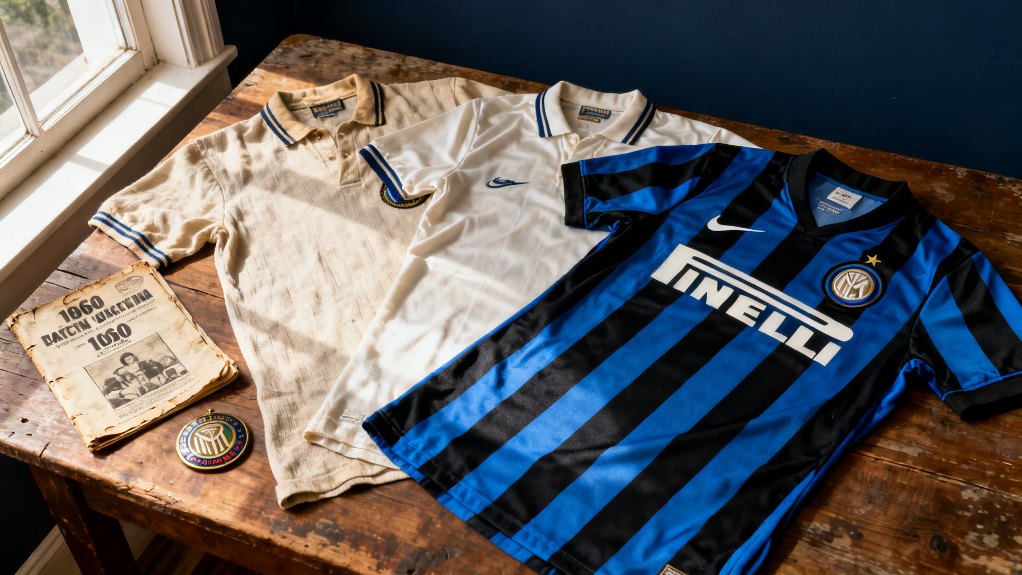
By the 1950s, the stripes had settled into the proportions most fans now recognize: roughly equal-width bands of black and royal blue, running vertically from shoulder to hem. The collars of that period had a modest stand, almost like a dress shirt collar with a small button at the throat, a feature common to Italian football kits of the postwar years. Shorts were short and tight. Socks reached the knee with a turn-down cuff. The whole look had an elegance that modern replica manufacturers spend a lot of money trying to recreate.
The Grande Inter Years and the Kits That Carried Them
Between 1963 and 1966, Inter won two European Cups and two Serie A titles under manager Helenio Herrera, and the kits worn across those seasons, clean round-neck cotton shirts with sharply pressed black-to-blue transitions and fully embroidered crests, are now among the most coveted pieces in Italian football collecting. This is the Grande Inter period and it is probably the most studied chapter in the club’s tactical history.
The early 1960s Inter jersey had a clean, slightly wider stripe than the 1950s version. The crest was embroidered directly into the fabric, not a heat-pressed patch. You could feel the raised thread when you ran a finger over it. The collar was a classic round neck with a short white trim, which gave the shirt a crisp finish that photographs beautifully in black and white, which is mostly how those matches were documented.
The 1965 European Cup final shirt, worn against Benfica in Milan, is one of the most sought-after vintage Inter Milan kits in collector circles. Original match-worn examples surface perhaps once or twice a decade at specialist auction. According to Italian kit historian Luca Canuti, who catalogued several authenticated pieces for the Italian Football Museum, confirmed sales of these shirts have reached sums above £30,000 for fully authenticated examples with provenance documentation. Even quality reproduction versions made with period-accurate cotton weights and hand embroidery attract serious collector interest.
What made those shirts distinctive was not just the stripe width. It was the way Italian manufacturers at the time handled the transition from black to blue. No bleed, no gradation: a hard line between the two colors, pressed sharp. That precision reflected the craftsmanship of Milanese textile production at its peak.
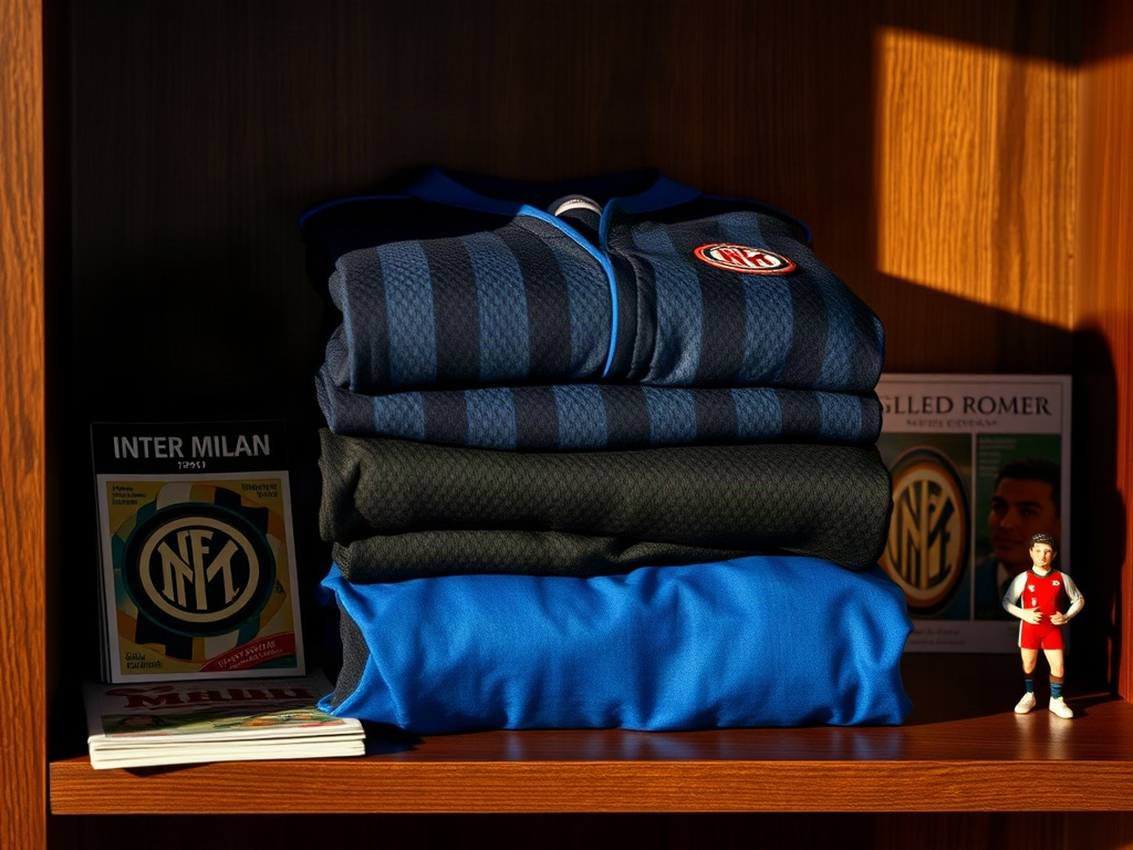

Grande Inter Tribute Concept Jersey
Inspired by the 1964-65 European Cup winning kits. Wide black-and-blue stripes, embroidered crest, heavyweight cotton-feel fabric.
Inspired by the 1964-65 European Cup winning kits. Wide black-and-blue stripes, embroidered crest, heavyweight cotton-feel fabric.
View in Shop
Manufacturer Eras and How They Changed the Fabric
The 1970s and 1980s brought manufacturer branding to Italian football shirts for the first time, with Umbro, Mistek, and Uhlsport each leaving a distinct fabric fingerprint on the Nerazzurri kit, shifting it from heavy cotton toward synthetic blends that changed how the stripes looked under stadium lights. Each era has its defenders among collectors, and each has a different texture story.
The mid-1970s versions used a synthetic blend that was lighter than the previous cotton, which helped players in the heat of Italian summers, but gave the stripes a slightly different visual quality. Under stadium lights, polyester-heavy shirts catch the light differently than cotton. The blues looked slightly more electric. The blacks stayed deep. Some supporters hated the change immediately. Others barely noticed.
The 1980s brought arguably the most experimental period in Inter’s kit design. This was when clubs across Europe started treating the jersey as a commercial product as much as a sporting uniform. The 1988-91 period under Umbro included some of the most unusual detailing Inter had ever worn: shadow patterns woven into the black stripes, textured weaves on the blue sections, and collar designs that reflected the broader fashion aesthetics of late 1980s Italy. The 1990-91 Serie A winning kit is now one of the most replicated of that era.
Nike took over kit production in 1995 and held the contract through 2021. That 26-year relationship left a deep mark on the visual record of the club. The late 1990s Nike kits leaned into a sleeker, more minimal design language, with thinner stripes and very little additional detailing. The 2000s brought Dri-FIT technology and a move toward a more athletic, body-mapped cut. The 2009-10 treble-winning shirt, worn during Jose Mourinho’s historic season, is among the best-selling replica jerseys the club has ever produced, and the demand for good-condition originals has only increased since that campaign passed its fifteenth anniversary.
Inter Milan 1990s Shadow-Stripe Concept
A modern reinterpretation of the Umbro shadow-stripe era. Woven tonal pattern in the black sections, structured V-collar, and heat-bonded badge.
A modern reinterpretation of the Umbro shadow-stripe era. Woven tonal pattern in the black sections, structured V-collar, and heat-bonded badge.
View in Shop
Away Kits and Third Shirts: Where Inter Took Real Design Risks
The home shirt gets all the attention, but the away and third kits are where Inter Milan kit design history gets genuinely interesting: when your home kit is locked into black and blue stripes, the secondary colors become your only real canvas, and Inter’s designers have used that freedom in ways that range from quietly elegant to flat-out audacious.
The classic Inter away has historically been all-white or primarily white, sometimes with black and blue trim. The late 1980s and 1990s are full of exceptions. There were gold-accented versions, an all-black away kit from the mid-1990s Nike era that still looks striking today, and a cream-colored third kit from around 1997 that only appeared in a handful of matches and is now genuinely rare in clean original condition.
The 2013-14 away shirt, a clean white with electric blue horizontal accents and a subtle silver weave, is a good example of Nike balancing heritage with contemporary design. The 2019-20 away in royal blue with a subtle graphic pattern woven into the fabric shows how far technical kit manufacturing had come: the pattern was only visible when light hit it at a specific angle, a detail that reads as almost nothing on a broadcast but looks exceptional in person.
Concept kits inspired by Inter’s away history have become a popular category among designers and fans who want to see the Nerazzurri in unexpected colorways without breaking from the club’s aesthetic logic. The best concept designs in this space stay grounded in the existing palette but push the geometry or the fabric treatment. You can find thoughtfully designed examples of exactly this kind of work across our concept jersey collection, where designers take the crest and color story of historic clubs and rebuild the design from new angles.
The Return to Heritage: Kits from 2021 Onward
When Adidas replaced Nike as Inter’s kit manufacturer in 2021, the shift in aesthetic was immediate and deliberate: wider stripes closer to the 1960s proportions, structured round-neck collars, and embroidered rather than rubberized crests, signalling a conscious reconnection with the visual language of the Grande Inter era. For collectors who had watched the Nike era gradually thin the stripes and flatten the badge, that first Adidas season felt like a correction long overdue.
The 2021-22 home shirt brought back wider stripes closer to the proportions of the 1960s. The collar returned to a more structured round-neck design. The crest sat centrally, embroidered rather than rubberized. That first Adidas season drew strong reactions from collectors and supporters who felt the jersey had finally reconnected with the visual language of the Grande Inter era.
The 2022-23 kit leaned further into archive references, with a shadow pattern woven across the black sections that echoed the 1988-89 Umbro design without directly copying it. Inter’s commercial team openly discussed the archive research process in press materials, which signaled something real: manufacturers are now competing partly on their ability to read a club’s historical identity correctly. Fans notice when a design team has done that homework.
The 2025-26 home shirt continues that direction. The stripe width sits closer to the historic norm than anything produced between 2005 and 2015. The blue chosen is closer to the traditional royal blue than the brighter cobalt that crept into Inter kits during the late 2010s. For anyone who tracks the Inter Milan jersey evolution by decade, the current direction looks like a genuine re-anchoring rather than a temporary fashion choice.
Inter Milan Heritage Concept Jersey (Adidas-Inspired Era)
Wide heritage stripes, royal blue matched to the traditional 1960s swatch, embroidered crest, structured round collar. Designed for collectors who want the feeling of the current heritage revival without the retail markup.
Wide heritage stripes, royal blue matched to the traditional 1960s swatch, embroidered crest, structured round collar. Designed for collectors who want the feeling of the current heritage revival without the retail markup.
View in Shop
Frequently Asked Questions about Inter Milan Jersey History
Why are Inter Milan’s colors black and blue?
When Internazionale was founded in 1908, the founders chose black and blue from scratch to represent the night sky: black for darkness, blue for the stars, a visual identity that belonged to no single city flag or regional tradition. The club’s founding ethos of internationalism meant they wanted colors that felt open and universal rather than local.
What is the most iconic Inter Milan kit ever made?
Three shirts come up constantly in collector discussions: the early 1960s Grande Inter home shirt worn during the European Cup wins of 1964 and 1965, the 1988-89 Umbro shadow-stripe design, and the 2009-10 Nike treble-winning shirt. Each represents a distinct chapter in the club’s success and each has a different collector market around it.
When did Inter Milan change from cotton to synthetic jerseys?
The transition from cotton to synthetic fabrics happened gradually during the 1970s as synthetic blends became standard across European football, with full polyester construction becoming common in Inter kits by the early 1980s. Cotton-dominant shirts from the 1950s and early 1960s are now considered the most desirable for textile collectors because of the way the fabric ages and holds its color.
How do I spot a genuine vintage Inter Milan shirt versus a reproduction?
On pre-1990 shirts, check the embroidery first: original crests used thread that sits slightly raised above the fabric, with visible stitch lines when you look closely, and the underside of the badge on a genuine piece shows the backing weave rather than a clean flat surface. Washing labels on genuine Italian shirts from the 1960s to 1980s are typically small woven labels in Italian. Reproductions often use printed labels and slightly glossier thread on the badge. Weight matters too: original cotton shirts from that era feel noticeably heavier in hand than any modern reproduction.
Are there Inter Milan concept jerseys based on historical designs?
Yes, and this has become a well-developed category: designers working in the concept jersey space regularly produce work that reinterprets Inter’s heritage, particularly the Grande Inter era proportions and the 1980s shadow-stripe experiments. The best examples stay faithful to the Nerazzurri‘s color logic while adding a modern fabric or structural element. Our concept jersey collection includes pieces that take exactly this approach to iconic Italian club identities.
How does the Inter Milan jersey compare to other Italian club kits in terms of consistency?
Inter sits alongside Juventus as the most visually consistent club in Italian football: both have maintained a core color identity across more than a century, with only the stripe proportions, fabric technology, and collar details shifting meaningfully from era to era. By contrast, clubs like other Serie A sides have gone through full color and badge overhauls multiple times in the same period. That consistency is a genuine differentiator and part of what gives the Inter shirt its collector resonance.
What the Stripes Actually Tell You About the Club
There is something worth saying plainly about what it means that Inter Milan has kept roughly the same shirt for 115 years: most commercial sports properties treat the kit as a rotating marketing platform, but Inter has moved the needle only on details, stripe width, collar cut, fabric technology, badge treatment, while the core visual identity has never been genuinely threatened.
That kind of consistency creates a particular relationship between the shirt and the supporter. When you wear an Inter Milan jersey, you are wearing something that looks recognizably like what Sandro Mazzola wore in 1965, what Ronaldo wore in 1998, what Diego Milito wore when he scored twice in the Champions League final in 2010. The jersey connects those moments across time. That is not marketing language. The fabric actually carries the record.
For anyone looking at the history of Italian football through kit design, Inter sits alongside Juventus as the most visually consistent club in the country. Their approach to the black and blue stripe has influenced designers working across the full spectrum of Italian football identity, from Serie A replica kits to original concept designs built on that same color tension between darkness and deep blue.
The shirt does not need to shout. It has been saying the same thing since 1908, and that is enough.
The shop
Find your jersey
Every Inter Milan jersey, with your name and number on the back if you like.
- Free shipping from $65
- 3 jerseys = 1 free
- 14-day returns